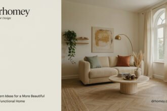

Decorating a room can be easier when you have a simple way to balance colors, materials, and furniture styles. If you combine too many competing elements, the space may feel busy. If everything looks exactly the same, it can feel flat. The 70/30 rule in design offers a useful starting point for creating a room that feels coordinated while still showing personality.
In interior decorating, the 70/30 rule generally means using one dominant style, color family, or design approach for approximately 70% of a space and a contrasting or complementary element for the remaining 30%. It is a flexible guideline rather than a strict mathematical rule, so you can adjust it to suit your room and preferences.
1. Understand How the 70/30 Rule Works
The basic idea is to create a visual foundation and then introduce enough contrast to make the room interesting. The dominant 70% establishes the overall look, while the remaining 30% adds variety and personality.
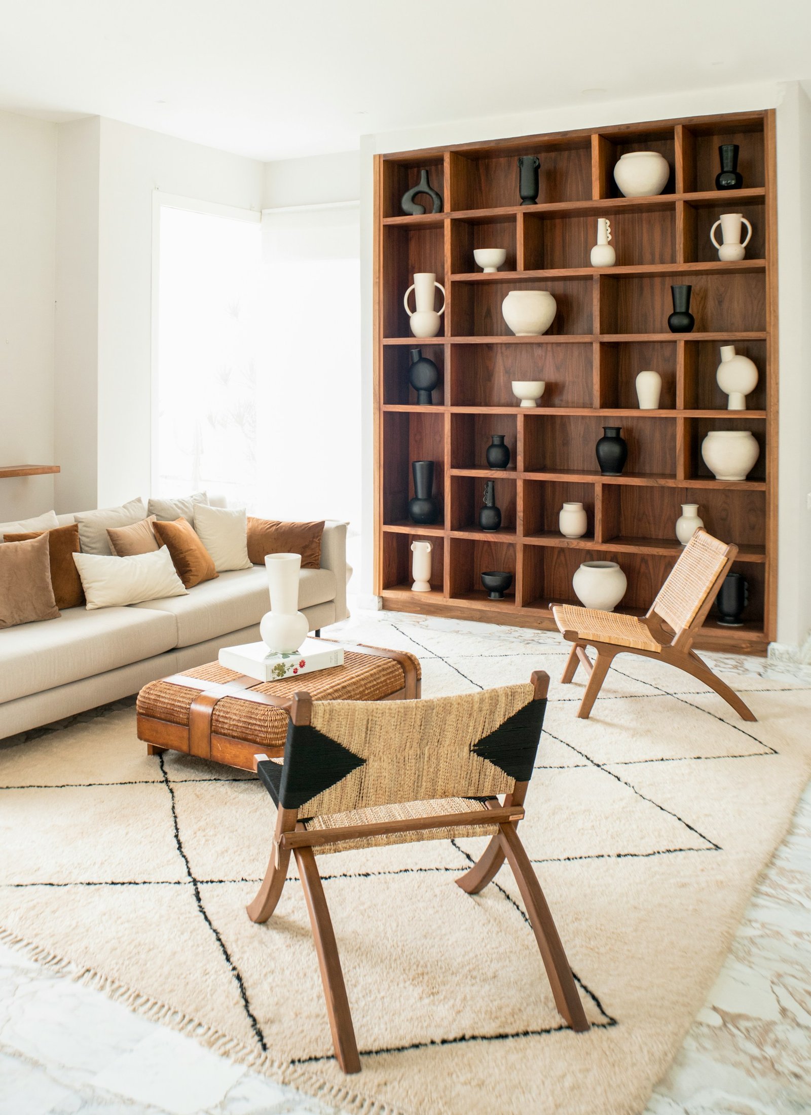
For example, a living room might use neutral walls, a beige sofa, and a light-colored rug as its main visual foundation. The remaining elements could include dark green cushions, a wooden accent chair, bold artwork, or decorative accessories.
The rule can also apply to different decorating styles. You might use mostly modern furniture and introduce a few vintage pieces for character. Alternatively, a predominantly minimalist room could include traditional artwork or textured accessories.
These proportions do not need to match the exact floor area or the number of objects. They describe the overall visual balance you want to achieve.
Practical tip: Choose the dominant look first, then select a smaller group of contrasting elements that complement it instead of competing with it.

2. Apply the Rule to Your Home’s Color Scheme
Color is one of the easiest ways to experiment with the 70/30 rule. Start with a dominant color that works well across the largest surfaces, such as walls, flooring, or major furniture pieces. Then use a secondary color to introduce contrast.
For example, you could decorate a bedroom with warm white walls, neutral bedding, and light wooden furniture. Deep blue cushions, a patterned throw, or a piece of colorful artwork could provide the contrasting element.
If you prefer a colorful interior, the dominant shade does not have to be neutral. Soft sage green, pale blue, warm terracotta, or muted pink can also work as a foundation when paired with complementary colors.
Before choosing your final palette, consider the room’s natural light, existing flooring, and furniture. Test paint samples under different lighting conditions so you can see how the colors change throughout the day.
Practical tip: Use your main color on larger surfaces and introduce contrast through smaller, easier-to-change items such as cushions, lampshades, artwork, and curtains.

3. Balance Different Furniture Styles and Materials
The 70/30 rule is not limited to color. It can also help you combine furniture styles, finishes, and materials without making the room look disconnected.
Imagine a living room dominated by contemporary furniture. A vintage side table, traditional rug, or antique decorative object can introduce character without changing the room’s overall identity.
Materials work in a similar way. A space with plenty of smooth surfaces, such as painted walls and glass tables, can feel warmer with wooden furniture, woven baskets, or textured fabrics. On the other hand, a room filled with rustic wood can benefit from a few metal, glass, or polished accents.
The goal is to create contrast while maintaining a connection between the different elements. Similar colors, repeated finishes, and complementary shapes can help diverse pieces work together.
You should also consider scale. A large statement chair may create enough contrast on its own, while several smaller accessories may be needed to produce a similar visual effect.
Practical tip: Pick one main furniture style or material and use a smaller number of contrasting pieces to add depth. Repeat at least one color or finish to connect the arrangement.
4. Use the 70/30 Rule in Small and Large Rooms
Room size can influence how you apply this decorating guideline. In a small room, a dominant light color combined with a smaller amount of darker accents may help the space feel open while still providing visual interest.
For example, a compact home office might have light walls, a pale desk, and neutral curtains, with a dark desk chair, colorful artwork, and a few decorative accessories providing contrast.
Larger rooms offer more opportunities to introduce distinct areas and materials. A spacious living room might use a consistent neutral foundation while adding a darker seating area, patterned textiles, or statement lighting.
However, light colors do not automatically make every room feel larger, and dark colors are not unsuitable for small spaces. Lighting, proportions, furniture size, and personal preference all influence the final result.
In open-plan homes, the rule can help maintain a consistent overall design while allowing individual zones to have their own character. Repeat a few colors or materials across the living, dining, and kitchen areas to connect them visually.
Practical tip: Consider the room’s existing features before choosing your proportions. Let the layout, natural light, and furniture determine where contrast will have the greatest impact.

5. Avoid Common Mistakes When Using the 70/30 Rule
Although the 70/30 rule is useful, following it too literally can make decorating unnecessarily difficult. It is a guideline for visual balance, not a requirement to measure every object or calculate exact percentages.
One common mistake is introducing a contrasting color or style that does not connect with anything else in the room. A bold accessory can look out of place if it has no relationship to the surrounding palette, materials, or shapes.
Another mistake is adding too many accents. If every cushion, artwork, lamp, and furniture piece demands attention, the room may lose its sense of balance. Choose a few meaningful contrasts and give them space to stand out.
You should also avoid buying new items just to reach a particular percentage. Start with the furniture and decorations you already own. Rearranging pieces, changing cushion covers, or moving artwork from another room may be enough to create a better composition.
Finally, remember that different rooms have different needs. A playful children’s room may benefit from more varied colors, while a bedroom designed for relaxation may work better with a quieter palette.
Practical tip: Step back and look at the room as a whole. If the main style feels clear and the contrasting elements add interest without creating visual clutter, your arrangement is working.

Conclusion
The 70/30 rule in design is a simple way to think about balance when decorating your home. By choosing a dominant style, color palette, or material and adding a smaller amount of contrast, you can create a room that feels coordinated without becoming predictable.
Use the guideline as a starting point rather than a strict formula. Experiment with colors, textures, furniture, and accessories until the room feels comfortable and reflects your personality. Often, the most successful design comes from making a few deliberate choices rather than adding more decorations.
Frequently Asked Questions
What does the 70/30 rule mean in interior design?
It generally means using one dominant design approach for about 70% of a space and a contrasting or complementary approach for the remaining 30%. The proportions are approximate and can be adapted to different decorating goals.
Is the 70/30 rule the same as the 60/30/10 rule?
No. The 60/30/10 rule commonly divides a color scheme into a dominant color, a secondary color, and a smaller accent color. The 70/30 rule is a broader guideline that can be applied to styles, materials, colors, and other design elements.
Can I use the 70/30 rule in a small room?
Yes. You can use a dominant color or style as the foundation and add contrast through a few accessories, furniture pieces, or artwork. The best combination depends on the room’s lighting, proportions, and purpose.
Do I have to measure the exact 70% and 30%?
No. The rule is intended to guide visual balance rather than require exact measurements. Use it as inspiration and adjust the proportions according to what looks and feels right in your home.