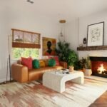

Quick answer: Color zoning uses distinct paint colors, rugs, and finishes to visually separate functional areas within an open-plan home, without the need for walls or partitions. Designers typically anchor each zone with a dominant hue tied to a cohesive palette, then reinforce the boundary using rugs, lighting, and furniture placement. This approach preserves an open, airy feel while giving each space its own identity.
Open-plan living has dominated home design for decades, prized for the way it connects kitchens, dining rooms, and living areas into one flowing space. But that same openness creates a problem: without walls, how do you signal where one activity ends and another begins? Color zoning solves this by using paint, textiles, and finishes instead of drywall to carve out distinct areas.
This technique has become especially popular among homeowners who want the social benefits of open-plan living without sacrificing a sense of structure. A reading nook, a dining zone, and a lounge area can all exist in the same room, each with its own visual identity, while still reading as one cohesive space.
Below, we’ll cover how color zoning works, practical ways to apply it, and what to consider before picking up a paint roller.
What Is Color Zoning in Interior Design?
Color zoning is the practice of assigning a specific color or tonal family to each functional area within an open-plan room. Instead of a single wall color flowing uninterrupted across the entire floor plan, each zone gets its own accent, whether that’s a painted wall section, a colored rug, or a cluster of furniture in a coordinated palette.
The goal isn’t to chop the room into disconnected fragments. Done well, color zoning uses a shared color story, like complementary tones or varying shades of the same hue, so the zones feel related rather than random. A deep terracotta accent wall behind a dining table might pair with a lighter clay-toned rug in the adjacent living area, linking the two spaces while still marking them as separate.
Why Choose Color Over Physical Dividers?
Homeowners choose color zoning over partitions, bookshelves, or half-walls for a few practical reasons.
Physical dividers block natural light and sightlines, which defeats much of the purpose of an open floor plan. Color zoning preserves that openness. It’s also significantly cheaper and less permanent. Repainting a wall or swapping a rug costs far less than construction, and it’s reversible if your needs change.
Color zoning works best for homeowners who rent, who want flexibility to redesign seasonally, or who simply prefer a softer transition between spaces rather than a hard architectural line. Choose physical dividers instead if you need actual sound insulation or privacy between zones, something color alone can’t provide.
How Do You Create Color Zones in an Open-Plan Room?
Start With a Base Neutral
Most successful color zoning schemes begin with a neutral base color, like warm white, greige, or soft taupe, applied to the ceiling and the majority of the walls. This neutral acts as connective tissue between zones, so the room doesn’t feel disjointed when color is introduced.
Assign an Accent Color to Each Zone
Once the base is set, choose one accent color per functional area. A kitchen zone might use sage green cabinetry or a painted island, while the adjacent dining zone picks up a muted ochre on a single wall. Keep the accent colors within the same tonal family (all warm, all cool, all muted) so they read as intentional rather than disconnected.
Use Rugs to Reinforce Boundaries
Rugs are one of the most effective color-zoning tools because they define a zone’s footprint without touching the walls. A patterned or richly colored rug under a seating area signals “this is the lounge” even when the walls stay neutral.
Repeat Colors to Create Flow
Pick two or three colors and repeat them in small doses across different zones, such as a cushion in the living room that echoes the dining chair upholstery. This repetition ties the whole floor plan together, preventing the space from feeling like separate rooms stitched together.
Use Lighting to Separate Zones
Pendant lights, floor lamps, and under-cabinet lighting can emphasize the boundaries created by color. A warm-toned pendant over a dining zone draws the eye downward and reinforces that area’s edges, especially once natural light fades in the evening.
What Mistakes Should You Avoid When Color Zoning?
Choose a limited palette if cohesion matters more to you than variety. Using more than three or four dominant colors across an open floor plan tends to feel chaotic rather than intentional. Skipping the neutral base is another common misstep. It’s tempting to go bold everywhere, but without a connecting neutral, zones can clash instead of complement each other.
Finally, avoid using color zoning as a substitute for furniture planning. Paint signals a zone, but furniture arrangement actually creates it. Pair your colors with deliberate furniture groupings for the clearest visual separation.
Bring Definition to Your Open-Plan Home
Color zoning gives open-plan homeowners a flexible, affordable way to create distinct, purposeful spaces, without sacrificing the light and flow that make open layouts appealing in the first place. Start small: pick one zone, choose an accent color that complements your existing neutral, and layer in a rug or lighting feature to reinforce the boundary. From there, expand the approach room by room until your whole floor plan feels both connected and clearly defined.
Frequently Asked Questions
Does color zoning work in small open-plan homes?
Yes. Color zoning is especially useful in smaller open-plan homes because it defines separate areas without the square footage loss that comes with physical partitions. Lighter, tonal variations work best in compact spaces to avoid making the room feel smaller.
How many colors should I use for color zoning?
Most designers recommend limiting an open-plan space to two or three accent colors in addition to a neutral base. This keeps the zones feeling cohesive rather than fragmented.
Can color zoning work with rentals?
Yes. Renters can achieve color zoning through rugs, furniture, curtains, and removable wall decals instead of paint, making it a flexible option when permanent changes aren’t allowed.
Is color zoning more affordable than building walls?
Generally, yes. Paint, rugs, and lighting cost significantly less than construction materials and labor required to build a physical partition, and changes can be made without demolition.
What’s the difference between color zoning and an accent wall?
An accent wall is a single decorative feature, while color zoning is a broader design strategy that uses color across multiple surfaces, like rugs, furniture, and walls, to define the purpose of an entire area within an open floor plan